drift font duo
tired eyes are an effective test of typeface readability. Even a favourite font gets more closely scrutinized under less than ideal reading conditions in the wee hours of the night.
And so it was with the licht. i favour this font for its clean geometric simplicity and optimal air between letters. It is a monospaced font (for the most part) with slightly tuned side bearing for its vertical stroke i l glyphs to yield a very unforced typeface.
However, at the very small font sizes i read at, and under less than ideal lighting conditions, the serifless lower case i often looks less distinct. Context, of course, is never a problem comprehending words but the visual impact causes visual jitter.. like a double take. It is for the most part unnoticeable but there—at least, i perceive it to be.
The remedy: to tweak the font, of course! Now, the grote font addresses this very effectively but i have developed a fondness for the radically unique reversed asymmetric t of the licht font. So enter the..
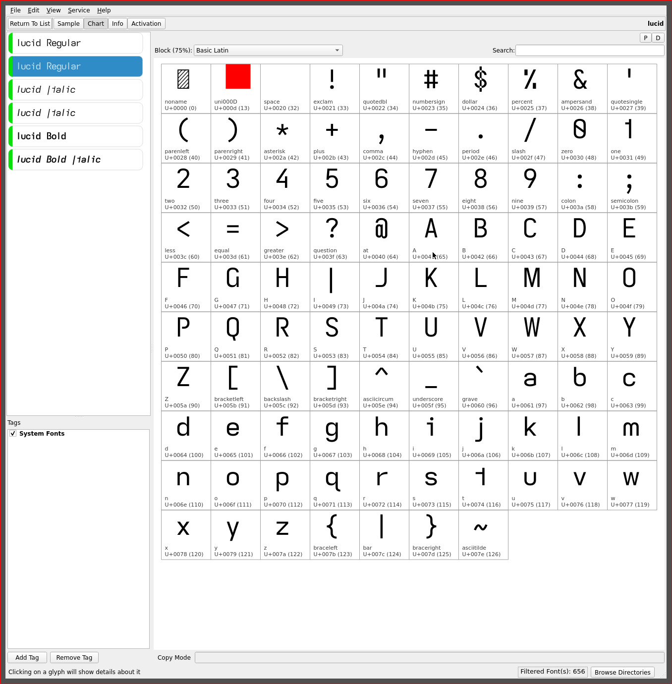
lucid font
which is simply the grote font with a reversed asymmetric t..

The change from the serifless lower case i back to the serifed glyph which has been present in all the fonts created (until licht) is sufficient to restore its legibility in i l letter combinations—the forest for the trees—when small font sizes challenge visual acuity. There is no denying the dot separation afforded by the glyph’s hook.
This simple fix led to another, in this case, influenced by recent changes to my coding font. The..
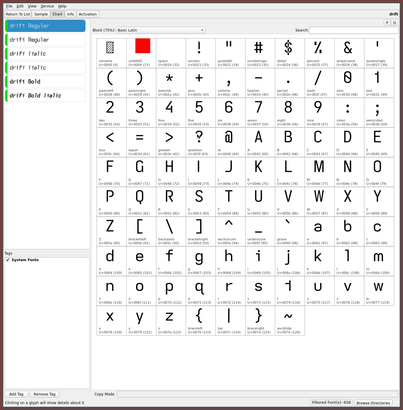
drift font
breaks my recent predilection towards the unique descending capital I with a standard height serifless I and the addition of the serifed hook lower case l..

similar to the serifed hook of the lower case i. The upper hook of the l adds air to its base and adjacent letters (unlike the lower tail used with prior fonts). With the reversed asymmetric t, these three glyphs all “point” in the same direction, imparting a sense of flow or direction and movement to the printed text. Hence, its name :)
The serifed l also allows the re-introduction of the standard height serifless capital I (a big bonus for those all caps headings and those who find the unique descending capital too radical). Despite my general aversion to serifed glyphs, this combination works surprisingly well, providing maximum visual separation from the serifless capital I.
This font is highly readable—i would rank it the equal of stria (or even a hair above it with the added air of the glyph set. YMMV)—with its additional distinctive serifs. My current source code font differs little from this glyph set—adding a serifed capital I, vertical-crossing Q and serifed 1 (one) for the maximum legibility required of coding fonts.
Its high readability may very well elevate it to the top of my font list for the palm readers i am considering, on which i would use even smaller font sizes.
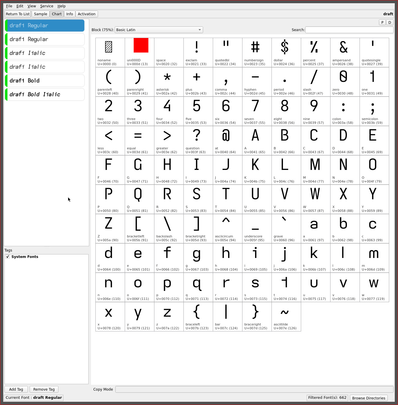
draft font
it didn’t take long and after less than two weeks another capital I lower case l combination emerged..

The draft font with its serifed capital I and the serifless lower case l (el). This font is the static counterpart to drift and yet another typeface with a standard height capital I.
Its “look” feels almost transparent in character as essentially the lucid font without the distinctive descending capital I. Perhaps it is the change up after such a long period of descending caps that i find this font quite refreshing. It has a very neutral character yet retains all the subtle non-mirrored glyph tweaks and is effortless to read with.
Then it was apparent: these two fonts come full circle back to the Atkinson Hyperlegible Font which began this exploration of typefaces and readability. Okay.. maybe a stretch when one considers all the changes since the elimination of mirrored glyph shapes for enhanced readability—the few personal minimalist (stroke) capital glyph choices and the reversed asymmetric t—but the “spirit” is there, even if my personal aesthetic is firmly stamped on these fonts.
It is apropos that its name should be “draft”. Emphasizing the line spacing format that promotes proofing :)
On the readability scale, both fonts score very evenly, though the hooked l of the drift font edges out draft (IMO. Though aesthetics may lean towards the serifless l of draft. YMMV). On KOReader i currently use draft for the header/footer and either for content—though, i am certain the descending I will find its was back into the rotation as well. For now it is a change up to standard height fonts :)
‧ ‧ • ‧ ‧
| upper case | licht | lucid | drift | draft |
|---|---|---|---|---|
| (eye) I | descending- serifless |
descending- serifless |
serifless | serifed |
| lower case | licht | lucid | drift | draft |
|---|---|---|---|---|
| i | serifless | serifed | serifed | serifed |
| (el) l | serifless | serifless | serifed | serifless |
repos
These asymmetric font variants may be found on OneDrive. The licht font and similarly serifless tweaked fonts may be found in its separate folder for both the Kindle and Kobo ereaders.
The Kobo set applies a line height spacing of 1x for a more universal application—such as for KOReader. The Kindle set applies a 1.9x line height to achieve an appropriate line spacing for optimal readability.